After rewriting the brief I concluded that in branding a restaurant, I wanted to sell the experience of dining out. Going out for a meal has become so much about being critical and analysing the experience, that I wanted to make it an occasion and something to celebrate. I started by looking at some examples that I though embodied an authenticity to their designs.


This design manages to exhibit quite a high class element in its design, but the inclusion of takeaway snacks and coffee makes it more casual and seem like an it has an air of the 'everyday' activity to it.


The stamp effect to this logo and titles to the menu lends itself to making the brand appear quite home made and authentic. I can imagine it would make a visitor feel quite comfortable in it's environment.


This design has an effective concept, but I find the colour scheme a bit harsh when it's based on food and comfort.


This design has been kept very simple, which works well with a simple name like Food + Wine. In it's minimalism it appears as quite a high class product.


This example is most applicable to my brief as it has included the proposal for a web based design. It has otherwise been stripped down and has been made all about the food, and since it focuses on one area it completely narrows down it's target audience.


This has quite an old fashioned design but has been combined with a sans serif type which counteracts it. Overall it now looks quite quirky and more interesting as there is a double side to it.


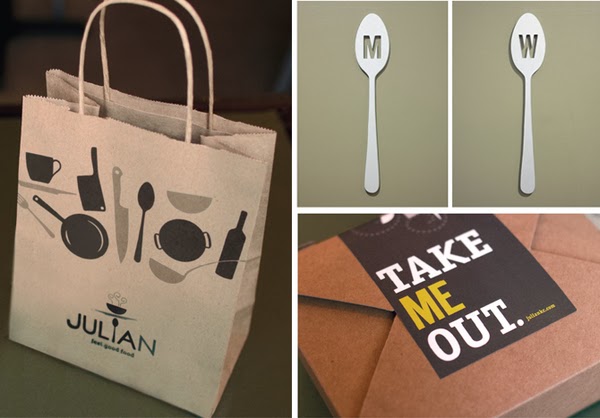
This brand has maintained a comfort food theme, which is reflected in its interior as well as the branded products.


This has been kept simple but effective in it's simplicity, it implies that there is a natural element to the products as the design has been kept basic.


This branding for Millie's Coffee House has made it all about the coffee, in it's illustrative branding, down to its exterior and packaging of the products.


This restaurant has a strong level of consistency in it's simple logo, it's one that has been used in the place of the name of the brand throughout the design and is very recognisable.


This design has been kept classic and simple, some aspects of it have quite a feminine feel, which is in keeping with it being branded for a cupcake shop.


The name 'Sissy's' is perfectly matched to it's design for this restaurant, and again has very feminine connotations. However, designs like this appeal to a very specific target market, but a male audience may not really respond to it.


This concept has focused mainly on the food, and has capitalised on the appeal of Asian cuisine, The colour scheme is effective for this idea but in the context of my plan, I want the colour scheme to be warmer.


This branding is consistent and the colours work with the brand but the logo seems a little disconnected from the idea of a sushi restaurant.