Tuesday 30 December 2014

COP3 Practical: PETA

I used the same format as my first booklet for the PETA version, which would exhibit examples of their previous advertising campaigns and identify the reasons that this could be seen as offensive by members of the public.


I chose the colour scheme based on the assumption that I will be using newsprint to create the booklet, which is about 20 pages long.


Monday 29 December 2014

COP3 Practical Take 2

I knew that this second design needed to be from a completely new angle. I was still interested in creating a series of posters as a campaign for PETA vegetarianism, but instead of exhibiting a gender neutral stance on it, I wanted to incorporate the same method they use of sexualising food, without being able to cause offence in the imagery or text.

A campaign that immediately sprung to mind was the Marks & Spencer food television ads that started in 2006:


While these examples don't overtly comment on anything of a sexual nature, but the combination of the soft music and the soothing female voice over is intended to hint at it. While the food is being presented as a sexy thing it cannot cause offence to anyone as it is up to the viewer to decide if it is sexual or not.

In order to tie the practical in with my essay, I wanted to acknowledge the stereotypes of men and women, referencing men's desire to be more manly than others, and women's to have the best figure.

I started a list of foods that I could include that would tie in with this concept:

- Steak (just a piece of raw meat)
- Bananas (considered a phallic symbol)
- Chicken (fillets - bra stuffing)
- Ribs (rack)
- Melons (resemblance to breasts)
- Plums

I started designing some simple layouts to follow for this selection, in A3 landscape as this format would aid an ads presentation in context eg, bus, billboard.

Sunday 28 December 2014

COP3 Practical

After spending some time finishing my written element, when referring back to the work I had done for the practical I found it difficult to synthesise with the writing. The posters I had completed weren't acknowledging the 'sexy' advertising, and as I had created them as alternatives to other unnecessarily sexy ads, I found it difficult to connect them with each other.

I decided I needed to narrow down what I was trying to do. Instead of using the food characters I had created for the first designs, which I had made into male/female to identify what an oddity it is to sexualise food, I tried to simplify it. I have instead decided to keep the idea of sex and food linked, without defining a specific gender. This allows me to acknowledge the somewhat derogatory nature of this method, without creating derogatory designs.

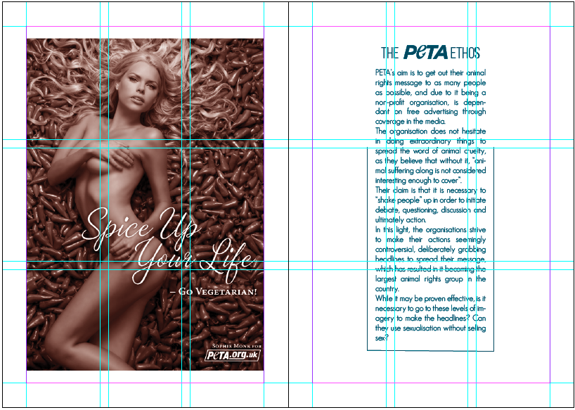
I still wanted to create an alternative campaign for an existing brand, and found in my research that, of all the brands I had looked at, PETA was surprisingly the most consistently inappropriate in their imagery:


The text above can be seen on PETA's website, where they themselves have acknowledged their controversial advertising techniques, arguing that they are designed to see animals as human, in order for people to recognise that animal cruelty is murder.

As a method for targeting animal cruelty as the problem, I can understand the reason for using caged humans, however one element to this I don't understand is the vegetarian aspect of the promotion. Vegetarianism is a choice that people make to not eat meat, the key word being 'choice'. Using a naked woman to make claims that eating meat induces erectile disfunction is a ploy to guilt a man into vegetarianism, because the busty blonde won't otherwise find him attractive.

I have concluded that I aim to rebrand their campaign for vegetarianism, a challenge given that I have no desire to stop eating meat. I plan to acknowledge the innuendos made but to eliminate the element of guilt to their current adverts and simplify the concept down to what the real focus is: food.


Wednesday 10 December 2014

COP3 Practical

I initially decided to create a booklet, that exhibited some of the adverts I had looked at in my research and design gender neutral alternatives. I chose a selection of advertisements to show how varied the sexualised products are, from ice cream to beer, all of these ads have used sex to sell. I wanted to ensure they were playful and non threatening, in some cases perhaps pointing out the obscurity of associating food with sex.

I have started to create the short A5 booklet to accompany the posters to be made out of the images I create as alternatives:


I decided to keep the layout consistent throughout as I wanted the image on the right page to be the main focus of the spread.


Before I had managed to finish, I began to rethink the concept of the booklet, as I felt that the synthesis with the written essay was not clear, and that there wasn't a totally direct link between the two.

I did not want the reader to have to search for the connection, I wanted it to be clear from the off set. After realising this I decided to start again, still creating a booklet and series of posters but creating a direct link between them and the essay.