Thursday 29 November 2012

A History of Type

Type makes the presentation of words as important as what is actually being said. For example, Gill Sans is an old English type (can be used to reflect a sentence/era)

Typography alters the way a message is received by the reader and allows the writer to put appropriate emphasis where they deem in necessary.

Type classifications:
- Humanist
- Old Style
- Transitional
- Modern
- Slab Serif
- Sans Serif

The first letterforms come from 113AD in the Roman Empire and Gutenberg Gothic type was the first moveable typeface, previously type was only printed by hand. This first printed word was very widely available.
In earlier typefaces the crossbar on the 'e' is tilted at an angle.


Nicolas Jenson 1475 = an early type face.
Geofrey Tory believed that type faces should reflect the form of humans.


Old Style:
15th century - explosion of typography in Venice which refined versions of more Humanist typefaces.
Centaur was humanist but became Garamond which was old style.
Old style typefaces include palatino, garamond, and perpetua, and use of these types expressed tradition and legacy.

Humanist were the early typographic attempts, Old Style was the development and Transitional was the latest.

1970s Modern type:
Didone was used a lot in fashion as it exuded glamour and elegance (Firmin Didone 1784)
Types became synonymous with particular styles.

Slab Serif came about in the Victorian times (1800s) and was designed for 'an era of industralisation'. It was used for marketing because it was a very 'loud' typeface, was used on billboards etc.


Times New Roman designed by Stanley Morison
Cooper Black 1927  designed by Oswald Bruce Cooper
Helvetica - the modernist type 

Post Modern Era

David Carson would use type and layout as the communication as oppose to the content of a piece of graphic design (grunge typography)

Friday 23 November 2012

Graffiti and Street Art

Goes back to cave paintings and drawings as Ancient Roman graffiti is similar to contemporary graffti.

Killroy US/Chad UK - a figure that makes a joke out of a social or political situation.
Paris riots 1968 - big day for graffiti

We are the Power - Illustrations of workers all fused together.

Urban Graffiti
1970s New York - graffiti exploded, made language of the street visible by having a cultural and political voice on the street.
See John Naar 1973 - preserves anonymity of graffiti art
Was an attempt at making graffiti considered art by the erection of walls specifically for graffiti.

Jean-Michael Basquiat street artist - used written messages and images and used a SAMO tag (stood for 'same old shit'). He has a poetic but at times confusing style which grew into a cult.

Keith Haring - 1990 Subway Art. He did sketches of existing advertising in the Subway, was commissioned to make big wall murals.
He has been criticised for the commercialisation of his work - was making money out of something which was originally meant to exhibit a particular message on the street.

John Feckner Broken promises 1980 - political statements through word art

Jenny Holzer Times Square Show 1980 - digital display of work which mimics the overload of written information on the streets - authoritative statements

Berlin Wall - comments on the lack of availability of technology and brands in East Berlin


Graffiti has been used in advertising in an attempt to communicate with a younger audience (videogame culture).

Invader - French artist deliberately made his street art difficult to remove.

Street art re-emergence
Banksy - Kate Moss made as iconic as Marilyn Monroe
Shephard Fairey - Obama poster
JR - parisian photographer blew up photographic portraits and placed them on the sides of buildings, associated it with locals.
Free Art Friday - group of people that work worldwide putting labels on pieces of work that can be taken away.

Sunday 11 November 2012

Studio Task 1 - Critical Analysis

Identify and explain 5 reasons why critical analysis is an important part of education, learning, and developing your understanding.

1. Critical analysis allows us to see our own work in a different light to how we may previously have viewed it, allowing you to see it from the audience's point of view and look past the technicalities.

2. It helps us to determine when and how we should progress with this design feeling more informed, and if there is a specific direction in which we should take it.

3. It draws attention to the mistakes or things that need changing in the design, parts of the design that we may not have realised previously.

4. Similarly, giving critical analysis may sometimes be applicable to your own work, and you may notice some things that need altered in someone else's design more than in your own.

5. Critical analysis is as much about the design and aesthetics as it is about personal interpretation, and there may be some ways in which your design is interpreted that you didn't know.

Identify and explain why the group critique is useful in the development of your work, skills and opinions.

Group crits are ideal in identifying how other people have interpreted the same brief you received, and how your concepts differ. In some cases it may highlight the need to do more work, similarly, identifying other designers processes and developments may aid your own work. Receiving feedback in the group crit gives a varied interpretation of your work and helps identify themes or patterns in the audience's view of it, allowing you to exaggerate or stifle these themes accordingly. It brings to light some factors or problems with your design that your eye cannot see.

Choose 5 criteria from the list generated in the session. For each, briefly summarise what will generally effect how you judge what you like and dislike when analysing examples of work.

1. Concept:

A weak concept often translates to a weak design but a stronger one can often make design more effective. A good concept requires the designer to consider every way in which the design could be interpreted, and aid each interpretation. It is often a case with areas of design (like branding) in which the designer only focusses on aesthetics and doesn't look at the bigger picture.


Examples of concept-less logo designs.

2. Layout

I need layout to be clear, concise and followable without being overwhelmed by text, image or composition. The layout should both be in accordance with the concept and should be considered heavily when determining the context in which the design will be placed. There should always be a balance of text and image and of colour.


3. Colour

Colour is the main factor that will determine how your design is interpreted. It is supposed to embody the concept, and colour is there to aid the designer in setting the appropriate tone of voice, not to try and grab attention. It should remain consistent throughout different designs if they are all part of the same concept.


4. Media/Production

Execution of a design should strive to be outside of the box, but ultimately should embody the theme and concept of the whole design. The context in which it is being placed must be considered to ensure it has maximum effect. Stock makes a really huge difference to printed designs and should be experimented with.


5. Legibility

Without a legible type, the design loses it's functionality and is deemed unsuccessful. Type doesn't have to be simple to be legible and it can be altered (although perhaps only for headings). There should be a balance with the type which creates something that doesn't overwhelm the eye.


Thursday 8 November 2012

A History of Creative Advertising

William Hesketh Lever marked a starting point for creative advertising who founded Sunlight Vision with James Darcy in 1885 and today Unilever advertise for over 900 brands including Ben and Jerry's and Bertie.

Packaging technology was invented in 1860 when Kelloggs figured out how to print and fill their cardboard boxes mechanically.
Lever was the first to advertise pre-packaged bars of soap.

- Brand value was added to a product through advertising and packaging - 

Advertising Boom
Advertising was aided by tax cuts on newspapers as tax relief.
1880- printing boom when colour images, colour printing and pictorial ads in magazines began.
1885 - co-founder of the Lever Bros.
1890 - technology - contemporary painting could be reproduced

Lever Bros. became the first multinational in the world and in 1930 it became Unilever, the largest corporation in Britain.

What was so much better about Unilever advertising?
- Started to use contemporary paintings in advertising
- Used paintings depicting women, white men and children which created an instant morality high as children are a popular subject (signify joy, purity, innocence)

Lever used George Dunlop's 1879 Alice In Wonderland painting and Albert Chevallier Taylor's "A Dress Rehearsal" painting in 1889 "As Good As New"ad posters which was used to sell washing soap for clothing.

Use of contemporary art expressed a more powerful, interesting and innovative message and encourages people to get a copy of the prints to hang in their own homes.

Lever was one of the first to use product placement in image which encouraged loyalty to brands through generations.

Innovative events:
- Lever Bros. Switzerland - organised a washing event when new offices were opening
- Royal endorsement from 1892 by Queen
- Wrapper promos targeted mothers through children - receive a voucher or gift when buying soap

1899 Lever Bros purchased Philadelphia soap firm and the owner, Sidney Gross became director - was an expert at picking appropriate art for an advert.

Lever was seen as first worldwide executive creative director for his collaborative creativity, overseeing of advertising and constant research.
He like using ambience - use of space, choosing location
-Advocating truth in advertising is an asset, falsehood in advertising is a liability-
Tell the truth but keep it interesting.

Many ads possessed messages that the use of the product would make women's lives easier - emotive strategy (promised happiness).
Lever managed to convince the world that not only do people want these products but they need them by convincing them of things such as hygiene problems that they need to attend to.

Saturday 3 November 2012

Modernism

Examples of Modernist Graphic Design


Kandinsky's 60th birthday poster by Herbert Bayer
Recognised as Modernist in the tilted nature of the typography, and it's clear legibility exhibits a key feature of Modernism, where it's only aim is to convey a message. The bold and minimalist nature of the colour scheme and layout of the poster, is enough to attract a viewer to read the smaller text. The majority of the text is in uppercase and so is in keeping with the grid-like layout.
"From the beginning, Modernism had the urgency of utopianism: to make a better world by design"- Massimo Vignelli
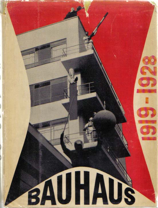


Bauhaus poster
There is an obvious current of structure and symmetry in this poster, fitting with the reputation the Bauhaus has for creating functional designs. While the colour scheme falls into the modernist bracket, I do think that a lot more thought has gone into layout than content which in my opinion takes away from the modernity of it.
"Modernism was never a style, but an attitude. This is often misunderstood by those designers who dwell on revivals of the form rather than on the content of Modernism" - Vignelli


This example seems to have exaggerating the concept of Modernist graphic design. There is an obvious structure to the layout of it, kept simple and efficient. Form clearly follows function in this design, with the page split into three sections to accomodate each language (German, English and French)
"Modernism was and still is the search for truth, the search for integrity, the search for cultural stimulation and enrichment of the mind" - Vignelli
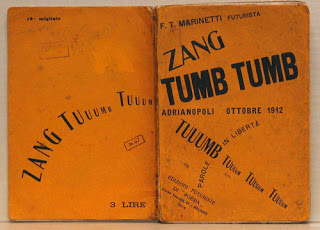
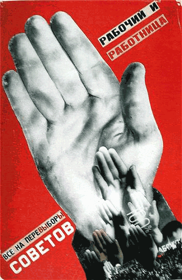


COBETOB
Clearly created in the Communist revolution, this example is simple in it's typographic content and effective in it's repetitive imagery. It has an experimental quality with the hand montage and the tilted typography making the whole thing knocked on it's side, unlike much else that would have been seen at the time. The experimental aspect is very in keeping with modernist works and fits the criteria well.
"The revision of many of the Modernist issues have enriched our perception and have contributed to improving the quality of work" - Vignelli


The London Underground Map is an ideal example of Modernist Graphic Design. While the map isn't an accurate representation of the Underground system it is very close and has been laid out in a way which is much easier to follow than the original version. The colour code makes the whole map universally understandable.
"I value, endorse and promote the continued relevance of the Modern movement as the cultural mainstream of our century" - Vignelli


Examples of Post-Modern Graphic Design


Neville Brody's The Face magazine
The design is a burst of colour compared to any Modernist works, the whole spread exhibiting a collage and doodling effect. Brody's very distinct habit of including variation in typefaces and the mixture of structured content with the sharp edges show the design to be overpowering the content, perhaps taking away from it. While it is in-keeping with elements of Post-Modernism, it seems very exaggerated.
"The lack of profound ideology eventually brought Post-Modernism to it's terminal stage" - Vignelli


Beethoven poster by Michael Cronin
This poster has a minimalist but decorative approach, the odd combination of colours making it quite playful and post-modernist. The lines on the manuscript paper are inconsistent and cut off in the middle of the page, consistent with the pop art nature of the blue image. However, the image seems quite fickle and upon looking at other designs of posters for Beethoven performances, it has little consistency with them, this image could easily have been following the trend.
"Modernism's inherent notion of timeless values as opposed to transient values still greatly appeals to my intellectual being" - Vignelli


Barbara Kruger's book cover
The overlapping and 'broken apart nature of the typography in this design is typical of post-modernism in design. However the colour schemes fairly neutral and reminiscent of pro-Communism designs, it appears as though this cover looks more post-modern than each feature actually is. In spite of this, the image looks all together quite random with the placement of the type and gives no background or explanation with it.
"Much still has to be done to convince industry and government that design is an intergral part of the production process and not last-minute embellishment" - Vignelli


Barney Bubbles trademark BLOCKHEAD
This design breaks traditional typography rules and has a humorous approach, using the letters to convey the word. Although this is a simple monochromatic design, the layout and typography are typically post-modern, altering the size and natural structure of a word.
This design lacks "truth, integrity, cultural stimulation or enrichment of the mind" in the same way that Vignelli describes Modernism.

Thursday 1 November 2012

Message and Delivery - Research

I tried to look into how theft and burglary awareness is already being broadcasted and found limited options, some exaples of which are below:


Most of the results were for things other than security within the home, and more looking after your car and possessions while you're out of the house. Nothing I found was very helpful at informing people of the facts or of precautions that they should be taking, and some were just trying to advise presumable pre-existing burglars to stop stealing.

Graphic Design - A Medium For The Masses


Monday 29 October 2012

Message and Delivery - Research


Having a vested interest in the topic of burglary, I chose to base my research on an article from Daily Express, about a 19 year old thief wh admitted to breaking in and burgling 278 separate homes between 2005 and 2011.


I looked further into youth crimes and found many similar articles about remorseless teenagers, many of whom were said to have possessed very arrogant attitudes when spoken to about their crimes. One article that stood out to me was the one below from last year, about a teenager who wrote a letter to the victims of his burglary claiming he was "not bothered" and that the whole ordeal was "their fault anyway".


The short letter he wrote reads as follows:

"Dear Victim, I don’t know why I am writing a letter to you! I have been forced to write this letter by ISSP.
“To be honest I’m not bothered or sorry about the fact that I ­burgled your house. Basically it was your own fault anyway. I’m going to run you through the dumb mistakes you made. Firstly you didn’t draw your curtains which most people know to do before they go to sleep.
“Secondly you're dumb you live in Stainburns a high risk ­burglary area and you're thick enough to leave your downstairs kitchen window open. I wouldn’t do that in a million years.
“But anyway I don’t feel sorry for you and I'm not going to show any sympathy or remorse.”

I began researching the sort of crimes people aged 10-17 are involved in, and found that while the rate of violent crime committed by juveniles had been decreasing since 1994, they account for a disproportionately large percentage of property arrests, with their percentage of robberies sitting at around 35%. The graph below shows the 12 most common non-violent crime, and the percentage of which youths are responsible in 1999.

To get a broader sense of more recent happenings as oppose to stats from over 10 years ago, I began researching into burglaries specifically. I found that an impressive percentage of violent crimes happen as a result of a burglar being interrupted, which surprised me because to my knowledge I thought a burglar would be as scared of the victim as the victim is of them.

While I believe that victims of burglary aren't in anyway deserving of what happens to them or are to blame at all, I do not believe that all victims can be faultless. Often in shared housing, people become careless, perhaps under the impression that someone else will take care of locking up the house. I looked up some information about opportunist burglars, those who will literally walk past a house, see lights off and an open window and make their way in, and in a lot of cases doors are left unlocked and occasionally completely open, allowing burglars to literally let themselves in. A large percentage of burglars will come through a front or back door, some a bottom floor window, and surprisingly, some will manage to enter through the basement.
I also found that a majority of burglars will return to the house they robbed some weeks or months later, taking the replacement laptops, cameras, phones, house keys etc., bought in place of those that were last taken and, given the amount of times I have found that this has happened, victims of burglaries aren't taking the necessary precautions to ensure it wouldn't happen again.

Thursday 18 October 2012

Context of Practice - Task 3


While both these images are seemingly patriotic, one depicting an ‘American Dream’ type of scene, the other a successful British family, this is one of the few qualities they share. The subtler example is the man sitting with his two children being asked about the Great War designed in 1915, and is designed to persuade young men to join the army and fight for their country, with the caption “Daddy, what did you do in the great war?” showing admiration from his children.
The image ‘Uncle Sam’s Range’ is more obvious in it’s patriotism but less in it’s advertisement of the oven, the main focus being the family having dinner with what is supposed to be the rest of the world. This image seems to be intended to ignite pride in its viewer, shown in the repeated stars and stripes of the American flag and the vibrant use of its colours.
Similarly the first image does indicate a feeling of pride but it’s delivered more as a reward than an initial emotion. The fathers stare out of the image instead of at either of his children is captivating the viewer, an combined with the capitalisation and underlining of ‘you’ gives the impression that the reader is being spoken to directly and almost being guilted into it, implying that they will be made a hero if they signed up, and their children will be ashamed of them if they don’t. The father’s stance and attire, well-furnished house and happy well dressed children oozes success, especially given the admiration his children have for him.
However, the this image would not be unseen today, whereas the second would be widely considered inappropriate now, namely the black slave serving the food from the oven being advertised, the woman serving the food and the mocking nature of the ‘rest of the world’. The whole image insinuates wealth and hierarchy and isn’t very approachable.
Overall, while both these images radiate patriotism, their differences highlight the differences between British and American culture at the time, the British side seeming much more subtle, the symbolism in the Tudor rose a the backdrop not as overpowering as the array of stars and stripes and red and white in the American image. However, despite the differences each image is fitting to it’s purpose. The oven advertisement is effectively persuasive considering the time at which it was designed in its use of Uncle Sam, a mascot of the US, and it’s reference to American independence, and the campaign poster has the allowance to be subtler given that it is not selling a product. It is captivating in the confrontation of the fathers stare and the insinuating guilt is successfully executed.

Postmodernism Lecture

Things that had previously been seen as high culture had become warped and blurred due to popular culture becoming involved with it.

Modernism - 1860-1960
Postmodernism - 1960-today

Modernism was brought about as an optimistic coping mechanism post WW1 when improvements were made to technology which would supposedly improve life, whereas Postmodernism was brought about as a backlash to 'rules' and parodies previous ideologies.

Postmodernism -
- allows for styles and approaches to vary more
- shows juxtaposition to Modernism, and keeps it ironic
- questions previous traditions and possible limitations
- contributed to ethnic minorities and women having a bigger place in society

Las Vegas epitomised Postmodernity in creating a fantasy similar to that of Disneyland.
Pompidou Centre in Paris received a shocked reaction in its structure alone, more about the concept than the aesthetics of the building itself.

- Postmodern design made the function the main focus of the design, developing a personality in function that would fit into a consumer society -

- Postmodern fashion was designed as a response to modernism eg. Vivienne Westwood's sex boutique in 1975. Punk styles were introduced to change what was acceptable in society, and it threw together a lot of styles in order to shock - 

- Postmodernism fine art started off with pop art in response to the rise of consumerism, see Andy Warhol, Damien Hurst, Marchel Duchamp, Tracy Emin, Sarah Lucas -

- Postmodern advertising became about focussing on the unexpected eg Volkswagen "think small" in 1959 -


Postmodern Graphic Design
Magazine set up became more about appearance than content, and used the content to determine the appearance and redefined the rules of Graphic Design > David Carson
"Don't mistake legibility for communication."
Postmodernism had an attitude of questioning conventions, particularly those associated with Modernism, and shifted thoughts and theories on those conventions

See plato.stanford.edu/entries/postmodernism/

Thursday 11 October 2012

Visual Research for Alphabet Soup Part 2

Work by Suzie's favourite designer, Peter Saville


The work i was producing was starting to resemble that of 70's and 80's rock band logo's so I looked more into that:


Wednesday 10 October 2012

Modernity and Modernism Lecture


Below are some modernist examples of graphic design


Examples of post-modernist graphic design: