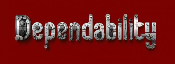
The main focus of my publication will be typography as it is my favourite area of Graphic Design, but T think I want to narrow it down to something more specific, perhaps typography in advertising or particularly bizarre type.
I started by looking at particularly effective typography in advertising as, in my opinion, if type is going to be used then it should embody the idea of the advertisement.
In some cases advertisements are required to provide a lot of information, and given that people aren't likely to stop and read a couple of paragraphs worth of information, they have found other ways of getting it through to people. I have chosen some examples in which I think type is used effectively.

This print ad is for an attorney's office and the image is supposedly representative of their attitude to work (fighting to win). The type holding their information is what makes up the image.

PS2 advertisement, although women may not like to admit it, I think that the type combined with the colours and subtle illustrations somehow suit what is being said well, even though I do think a girlier type could have been used. This has however been counteracted by the 'Because Your Girlfriend Bores You Shitless' type at the bottom.

This Kodak ad plays on a commonly used phrase, and the 'What are your pictures worth?' is effective in helping someone realise how they might love pictures. Even the repetition embodies the message that not enough words can illustrate the point of an image.

Given that this ad is in Italian I can't understand what's being said but the type combined with the image and colours is similar to a lot of other Italian based ads like Dolmilo.

Newport Beach Film Festival

Australia Post


Voyages SNCF

Orange

Species Risk Extinction

Nike


Toyota

Mitchell Eye Centre
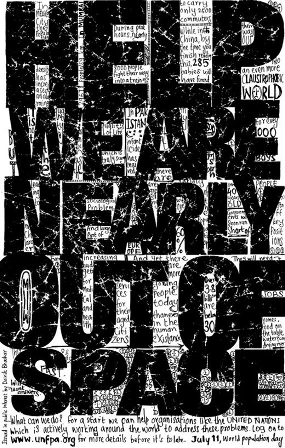
United Nations (Population Day)


After looking at these typographic advertisements, the idea of looking at bizarre typography seemed much less relevant to our original brief, as even this focal area of typography seemed a little too specific.
Before I had to make a decision I decided to look into actual publication layouts that would help me decide on the layout of my own publication.


No comments:
Post a Comment